Antarctica like you've never seen it before
Many months ago, we were approached about helping start up LocalWiki in Antarctica.
In.
Antarctica.
Antarctica!
The project, sponsored by the Open Antarctica organization, would aim to initially document a region of roughly 2 miles surrounding the Palmer Station United States base on the Antarctic Peninsula.
Our first question was: wait, there's Internet in Antarctica? And yes, there is Internet access on the Antarctic bases — access that's provided over an awesome looking, though incredibly slow, satellite uplink. So slow, in fact, that we briefly thought about sending our contact down to Antarctica with a plug-in computer running a little LocalWiki server — but ultimately decided it was too much work for little gain.
The next thing we started thinking about was mapping. Maps are a core feature of LocalWiki, so having a good map of the area, particularly the area near the research station, was really important. And ideally we'd have some aerial imagery and not just a vector map. "Let's take a look at some maps of the area!" we thought.
Given that we use OpenStreetMap data in our default base layer, let's check out what our OpenStreetMap-based tiles look like around the island containing the research station:
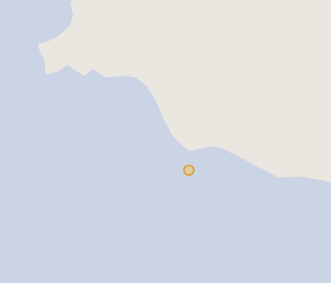 The orange dot is where the station is.
As you can see, the OpenStreetMap map doesn't really show any of the detail here — it's missing the whole peninsula the station is on! The story's the same with most freely-licensed satellite imagery:
 Typical freely-licensed satellite imagery.
Some commercial satellite imagery, like Google's, is better, but it's still not at the level of detail we wanted — and it's not freely licensed. There's got to be some good aerial imagery of this region out there, right? Maybe if I we found some good imagery we could stitch it together into a map?
Then we found this amazing NASA Photo of the Day:
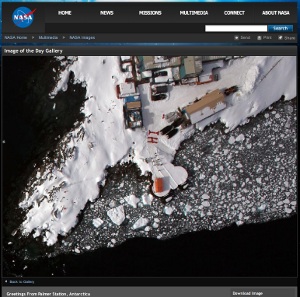
OH MY GOD! That's just incredible detail and quality! Hope!
Making the map
Searching through the USGS Earth Explorer didn't turn up anything near the quality of this NASA photo of the day image. Hunting around different NASA websites didn't seem to give many clues, either. The best clue was the photo caption from the Photo of the Day, which read:
[...] greeting to scientists and flight crew aboard NASA's DC-8 flying science laboratory as it flew over the station during Operation Ice Bridge.
After even more digging around, I stumbled upon the FTP site where NASA was hosting Operation Ice Bridge images. Presumably, the image from the NASA Photo of the Day would be in there — and hopefully a bunch of great shots of the surrounding area. The only problem was that the FTP site had many, many directories, each with thousands of files:
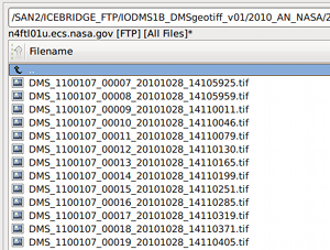
I experimented with downloading a few random images and plotting them in QGIS, but it quickly became clear that downloading all of the hundreds of thousands of images and plotting them using this way just wasn't going to work — there were too many images, we didn't have the many, many terabytes of required space, and the GeoTIFFs quickly overloaded QGIS. Alex Mandel recommended trying to find a pattern in the filenames — but after working on the problem for a bit we didn't seem to get anywhere.
So we ended up writing a little FTP client to grab just the few Kb of each file, which ended up being enough to get the location metadata out of the GeoTIFFs. With that, we could easily import the location of every image:
...and then start plotting them on a map, revealing airplane's flight path:
 The red dot is the research station.
Getting there... after plotting a few hundred thousand other data points:
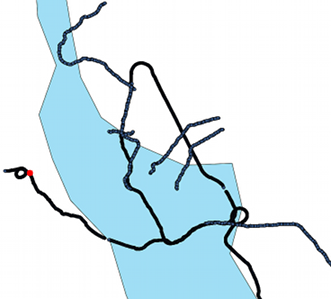 The red dot is the research station.
Sweet! It looks like there's quite a few images around the station! So there's some hope we can piece together a great aerial map of the region.
Overview / vector map
So, there's hope we'll pull off an aerial map of the region. But it's going to be pretty spotty — the NASA Ice Bridge project is set up to just snap photos of the coastlines, basically. We'll have to lay the aerial imagery on top of something. And because the project may later want to cover other regions in Antarctica, we'd like to have a good base map of the whole continent.
But the problem is that standard maps are designed to make most of earth look right when flattened out, always at the expense of Antarctica. Which usually makes a lot of sense.
 Antarctica, viewed on Google Maps. (© Google)
Paths around the South Pole would look really wonky with this standard projection. Fortunately, there's a better projection for Antartica. After much fiddling with Geoserver, we figured out how to get it to correctly reproject vector data in this esoteric projection.
So, we can reproject vector data into this fancy Antarctic projection, but where can we get decent vector data of Antarctica? As explained earlier, the OpenStreetMap data isn't very detailed. Thankfully, the fantastic Antarctica Digital Database comes to the rescue! They have highly-detailed coastline data of the entire continent that's freely usable for non-commercial purposes.
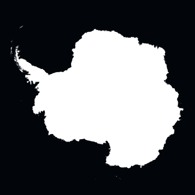 The zoomed-out-all-the-way map in all of its stereographic glory!
Stitching together aerial imagery
So, we've got all these images from the region around the station, but how do we stitch them together into a map we can serve and suck into OpenLayers?
Figuring out how to serve individual GeoTIFF files was pretty easy. The problem was figuring out how to stitch all of these images together. We tried out several of the Geoserver-specific approaches to image stitching, but none of them worked. The Image Pyramid plugin seemed to crash when using this Antarctic projection — and the same sort of crash happened when trying to import a VRT file of all the GeoTIFFs and when using the Mosaic feature of Geoserver.
Maybe we can just stitch the GeoTIFFs together ourselves, somehow? First, we tried using gdalwarp to do the stitching:
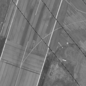 Area near the airport the plane took off from.
...which worked, but there are weird black lines in the image, what are those? Turns out the images, while TIFFs, were compressed internally using JPEG compression and we need to run the nearblack utility on them before stitching.
So, we threw together a script to clean up the images and continually stitch them together using gdalwarp. All done? Not so fast. The images, when uncompressed, balloon to around 2GB or so each — EC2 to the rescue! We spun up a server with an insane amount of disk and ran the stitch script for several days, taking a look at the output and tweaking it throughout.
This left us with one stitched-together, compressed GeoTIFF that weighs in at slightly less than 2GB. After building overviews for various zoom levels into the GeoTIFF, it was relatively easy to load it into GeoServer as a raster storage source and then combine it with the vector data layer. The aerial and vector layers didn't quite line up, but after fiddling a bit with the projection we got them be as aligned as could be expected.
The result
After much tweaking and dealing with strange errors — almost all of which related to map projection issues — we finally put together a beautiful map of Antarctica in a glorious stereographic projection with stunning aerial imagery of the region laid on top of it:
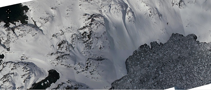
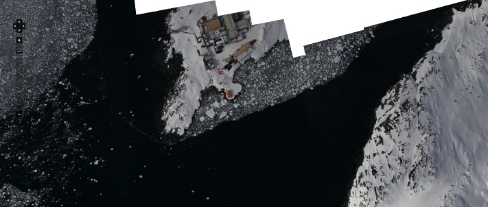 The area around Palmer Station. View map.
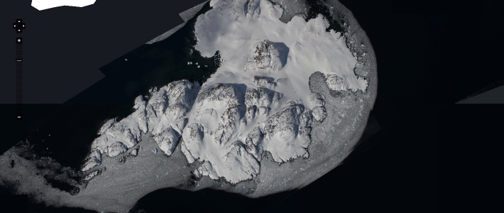 Litchfield Island, the "island most frequently seen in dreams." View map.
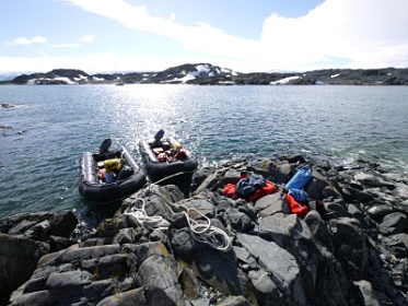
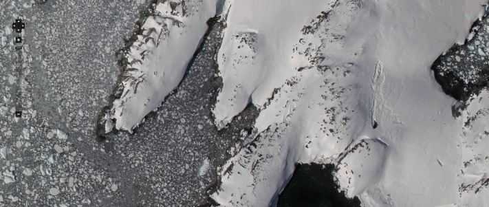 Shortcut Island. You can even spot a seal! View map, view page.
Some beautiful pages
You should explore the project! Here's some beautiful pages to take a look at:
- Breaker Island
- Christine Island
- Hot Tub in Antarctica!
- Humble Island
- Shortcut Island
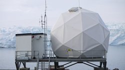
- Earth Station
- Wauwerman Islands
- Trolley
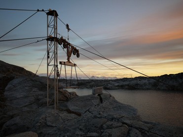 The station trolley.

