What should the logo for the sf wiki be?
Eye in the Pyramid. —BrentLaabs
The Golden Gate Bridge combined with the Transamerica Pyramid. —Jedron
Comments
2007-09-07 07:41:19 Sutro tower? fog? Cable car? —AmyZimmerman
2007-09-23 00:46:22 This may sound kind of weird... but perhaps some kind of abstract pattern? One idea could be something mimicking the brick circles around the embarcadero center. Landmarks are nice but may be a bit too cliche. Here is what I'm talking about. —DanielWorthington
2007-09-23 13:01:49 Yeah, I vote against landmarks, too. At least no overused landmarks like the Golden Gate Bridge. The circles a nice, but they might be a little too abstract. We need something that can be associated with the city. —NumiaCairaguas
2007-09-23 13:07:56 Idea roll: Hills, fog, the bay, gold, missions, peace signs, international issues, earthquakes... —NumiaCairaguas
2007-09-23 20:07:45 Simple sillouette-ish image of skyline. No cable cars, golden gate, etc. Combining too many things (like on the typical state quarter) makes it too busy. —KaiTing
2007-09-28 18:32:36 A curvy double lined lettering ala the muni logo Herebut saying SFWIKI —ElijahCombs
2007-10-04 13:01:49 I tried scribbling out something that looked like the muni logo for "WIKI" but I couldn't get it to look decent. Can anyone else scribble it well? Maybe it's not possible? Maybe I suck at scribbling? —PhilipNeustrom
2007-10-04 22:02:01 Oh, the MUNI idea is interesting. I tried a messy preliminary scribbling of "WIKI" just for kicks. It's not logo-material yet, but it's readable. Do we want the logo to be a word, though? How would we incorporate "San Francisco" into it? SFWIKI sounds good, but there's already a wiki with that name. —NumiaCairaguas
2007-10-05 00:50:58 Maybe something like this? —AmyZimmerman
- Ooooh, that's nice! Is it possible to expand the K a little? I like this. —NumiaCairaguas
-
Haha, that's awesome! We need to clean it up a bit — do you have a larger version someone could use for tracing in a vector image program (e.g. illustrator or inkscape)
- That was just a draft. I'm not so skilled with Photoshop or other drawing programs, but I liked Eli's idea and wanted to see how well it could work. I'm sure the K could be a lot better. — AmyZimmerman
- Ok everyone stop. I'm pretty sure we're done here. This is the best possible logo. Check out this free font for inspiration — MikeIvanov
Here's a side-by-side of the muni font and amy's design:

 capitalized and lowercase (with dots on i's) versions.
I think the capitalized version fits the muni logo parody much better. We should nudge the letters together a bit more, and do a tad bit of cleanup. The K in the font looks better, I think. —PhilipNeustrom
It's ELI's design! —AmyZimmerman
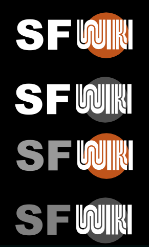
newer draft
I think "WIKI" should be smaller inside the circle and the original font for "SF" is way better, even the color. - MikeIvanov
Amy, do you remember what font you used for the "SF" part?
- Arial Black
Eli says to try and experiment with non-circle muni-like designs, a-la what's on the buses/stops (rather than what's on the website).
2007-10-10 11:35:26 I agree that the Arial font looks better, but the gray looks really weird when it's placed up in the top logo area. —PhilipNeustrom
more ideas
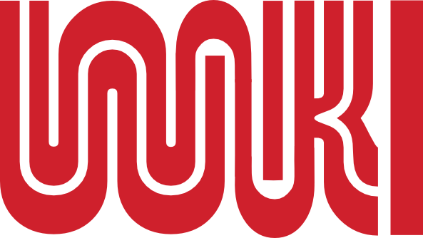
custom "wiki" logo
2007-10-12 07:54:13 I don't like that so much. The I is inconsistent. Although the main reason the Muni logo is so cool is because it flows like that... —AmyZimmerman
I don't think there's really a way to make the "I" totally consistent. The question is: can you tell it's an "I?" Maybe we could add a dot to it if it's not clear? Hmmm... What I like about the "customized" logo is that it's a lot more elaborate and looks like more work went into it, and so it could stand on it's own, so to speak.
The "I" isn't visible by itself, but I can tell that it says WIKI. My mind interprets it as WIKI. Have any of you heard about that word-recognition experiment where all the words in a paragraph were scrambled, but the first and last letters of every word were left in place? It looked like gibberish, but it was totally readable. It turned out that most people's minds read by paying attention to the first and last letters of words. The rest of the letters were just shapes that the mind recognized, no matter the order. The MUNI style logo is kind of like that. —NumiaCairaguas
2007-10-19 03:10:45
The latter is what you get if you apply the "rules" of the former — at least in my mind. —CJ
2007-10-19 15:21:45 It might be better to ignore the rules of the original muni sign and make the "I" into two vertical lines instead of one solid one. even though they don't do that in the muni one it might look truer to the original that way. —MatthiasGropp
You mean the final "I"?
2007-10-20 14:04:58
How's this? —CJ
2007-11-01 15:09:21 How's this for a favicon: ![]() ? —HimySyed
? —HimySyed
2007-11-02 08:22:52 I'd prefer a static icon, but if we were to use an animated one I think it should be a lot shorter. —AmyZimmerman
2007-11-09 18:25:41 I like the current one, but I think the "S" and the "F" should be slightly closer together. —Mingwong

